


The goal
RockEng's work, from rock engineering and numerical modelling to induced seismicity and hydrogeology, lives in reports, proposals and presentations. Those documents are often what clients see most, so they needed to look consistent, read clearly and be quick for engineers to produce without a designer on hand.
What we did
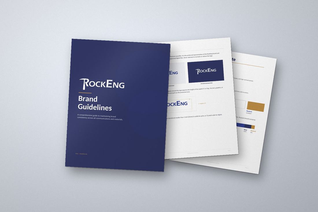
- Brand guidelines. One document that sets out the logo rules, colours, type and how to use them, including which logo goes on light and dark backgrounds.
- A defined colour system. RockEng Blue leads, supported by navy, greys and white, with a mustard accent used sparingly so it stays special.
- Type chosen for technical work. We moved the brand to IBM Plex Sans, because in Calibri the capital I, lowercase l and the number 1 are too easy to confuse in technical documents.
- Templates the team uses every day. A Word report template, a PowerPoint template and a corporate Who We Are presentation, all set up so the brand is built in.
- LinkedIn templates. Eight Canva templates so the team can post news, projects and hiring updates in minutes.
- Everyday assets. Logo files for every use and a branded email signature.
The result
RockEng now has one clear, documented brand and the tools to apply it without thinking twice. Reports, decks and posts look like they come from the same firm, and engineers spend their time on the engineering rather than on formatting.
More branding work: Sun Harvest Greenhouses · Inclusive Play Project · Branding and graphic design